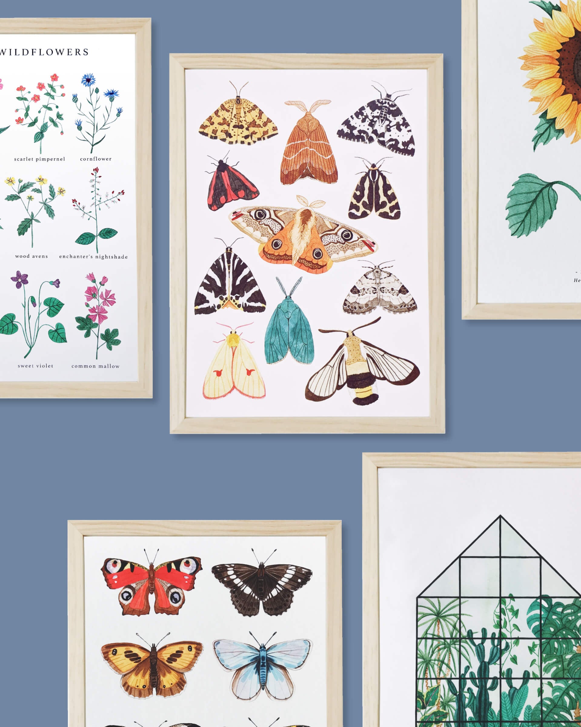
My new Tropical House print is becoming popular! This piece took a lot of turns as I worked on it, so I am sharing ‘behind the scenes’ how I created Tropical House from start to end.
I was initially inspired to paint it after visiting a local tropical house and taking photographs of these tropical plants
I picked out some of my favourite plants, and sketched them out before putting watercolour down.

Happy with the progress so far, I was hesitant to add the greenhouse frame – I thought I would ruin the piece, so I drew the greenhouse frame separately using grey Pro markers then positioned it underneath the plant paintings on Photoshop. I also painted the background. I was quite happy with how it looked but I couldn’t put my finger on why I was not totally satisfied with it.

I asked around for feedback, and what I got back was that it was not ‘busy’ enough – so on Photoshop I duplicated some elements to fill empty spaces. I also painted some trailing plants to add depth.

I later realised that the problem is the greenhouse frame, it didn’t enhance the whole piece at all. So I decided to redo the greenhouse frame, but this time thicker and with black watercolour. I scanned it in and placed it over the top as a frame rather than as a backdrop. I thought it looked better already. I left it open on my desktop so I could look at it every now and then trying to decide whether it was good enough

Then I had a brainwave, that I should add a triangular roof as well, which gave the piece much more definition. It also looked less crowded. Finally I did a wash of green and blue for the background and I thought it completed the piece very nicely.

Again I left it for a day or two to think about it. I decided that the greenhouse frame was too thick, so I painted one last, thinner version and found myself very pleased with the piece in the end!


